News
Color Trends
Spring,Winter,Summer
2007/2008
PANTONE
Fashion color report spring 2007
For 13 years, Pantone has surveyed the designers of New York Fashion Week to bring us the season’s most important color trends. This sketchbook previews color for spring 2007.New York Fashion Week, September 8-15, 2006 New York fashion designers are flourishing in a season of new beginnings, using surprising neutrals with innovative splashes of corals, yellows and purples to create a spring in bloom. Tarragon is the freshly cut stem to the blossoming shades of sweet Strawberry Ice, warm Golden Apricot and violet-infused Hollyhock. Café Crème is the rich, creamy contrast to the serenity of calming Sky Blue or the deliciousness of refreshing Grapemist. The yellow glow of gleaming Green Sheen and the blushing beauty of diaphanous Silver Peony reflect the infusion of life brought by spring. While cool Frost Gray was an important presence in fall of '06, the newest neutral for spring is found in glimmering Opal Gray, providing the background to spring's multifaceted, complex brights that can make even the most basic silhouette come alive.Read the full PANTONE® Color Report at:
http://www.pantone.com/articles/pdfs/PANTONEspring07.pdf
About PANTONE®Headquartered in Carlstadt, N.J., Pantone, Inc. is the world–renowned authority on color and provider of color systems and leading technology for the selection and accurate communication of color across a variety of industries. The PANTONE® Name is known worldwide as the standard language for color communication from designer to manufacturer to retailer to customer. For more inform
urchinTrackeation about the PANTONE® products, please visit www.pantone.com
Fashion Color Report Autumn/winter 2007
The autumn winter 0708 range develops in still waves to better ally with fabric. It calms the superfluous to secretly nurture fabric's incandescence. Shiny or ultra-matt, metallic, not completely plain or concentrated, colours grow languid with a serene and enveloping decency.
SILENT DENSITY
Round and deceptively soothing, neutrals gain in body and muffle pigments to exalt fabric. Crystallised, felted, powdery, vaporised, glazed, they unfurl a material consistency.
DELICIOUS PALPITATIONS
Nourishing or fleeting, reds bewitch warms, making them reel with feverish pinks or fiery oranges.Sanguine, pulpy, delectable and delicious, they flaunt a generous voluptuousness.
SULPHUROUS INFUSIONS
Suave and disturbing, controlled shades with ambiguous tonalities are modulated with an equivocal sophistication. Deceptively natural, discreetly chemical, they are liquefied, infusing and diffusing a dubious tepidness.
PRECIOUS BLACKNESSES
Sombre and disquieting, deeply tinted darks vibrate like gloomy jewels. Secretly metallic, extremely matt or absolutely shiny, they emerge violent or melancholic, severe or indecent.
Putting fabrics forth, beyond appearance, in delectable and reassuring envelopes. Exalting the generosity of softness and handles with fabric fantasies that speak to intimacy. Relying on the emotional power of fabric to awaken the senses.
FRAGONARD
Colours as if blended with clay and applied in dusty layers reminiscent of the Rococo painters Fragonard and Boucher. The auburn-red- and green-honey tints of their allegoric scenes look velvety and precious and at the same time perfectly modern for urban folk.
BURLESQUE
Kitsch and glamour, fashion for fun. Blending unexpected themes. Fresh greens and yellows and copper with faïence blue for a very groomed funky styling.
COUTURE ALLURE
With the return of elegant dressing, Haute Couture as an attitude is back and with it the colour black. Dark hues like graphite, shale and steel are the core of this palette, illuminated by yellow and purple accents.
BLONDE
These transparent cosmetic tints are inspired by blondes and their pale winter complexion. The soft pearly hues are cool and fresh, with a creamy raspberry lipstick red. Ethereal femininity continues to be a major theme for intimate apparel looks in outerwear in sateen and sheer decorative fabrics.
DOWN TO EARTH
Dusty greys take us to a walk in the autumnal fog. Transparent tints including lilac, asparagus, ice, putty and bark stand for our appreciation of the nature. A palette for urban and functional themes with felted fabrics or – totally opposed -- for refined feminine looks.
www.lenzing.com
Fashion Forecast Spring/Summer 2007
PURITY
Far away from all those everyday responsibilities and duties, this is an extremely summer theme, escaping to liberty, care-free days, innocence and sensuality. It’s pure in all its forms and, therefore, simple-casual but also extremely refined.
and gives access to added value services and tools.
ENERGY
This theme returns to the need for essential basics. Modern developments go hand in hand with retro classics, but it’s always comfortable. Inspiration comes from active sportswear, but also from classic basics. Unassuming, clean and simple and – particularly – playful, with attention to technical design details and made with great concentration.
REFINEMENT
It’s a refined city theme, inspired by work and city life. Our daily jobs require sincerity, mirrored in simple combinations in our dress behaviour,but the latter must also answer to our needs for the materials used to ensure constant elegance and a chic-sensual, feminine look.Straight lines, non-crease, thin and – above all – uncomplicated: these are -fit them into your hand- baggage qualities.
AUTHENTICA
muted classic/historical theme, as though in answer to the exuberant folklore theme for winter 2006/7. Historical influences from a whole world of rich, costume heritage translated into modern-day materials. Some of them have a vintage look about them, but they can also be fresh and crisp, with special attention to handwork. The basis is mainly original, classic garments like kimonos, caftans, officers’ jackets.. forecast spring/summer 2007
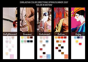
Between yesterday and tomorrow, from nearly colorless to full shade, from warm to cold. Colors in motion; they spice the season. Not without the E of e-motionWhen black is back - as it strongly is now - (did it ever go away ?), white is in competition and looking to get front stage this summer and to become the season’s star. Pure, buttery, creamy and tinted.Retro feeling and grandmother’s white linen; whites also as a sign for ‘Kaballa’ influences. Whites and neutrals have traces of color and are here and there accompanied by real colors.Real colors need the neutrals, they move into each others direction and influence each other. Fabrics with special treatment to create dimensional textures or layering effects, or which were subjected to washing or special dyeing processes that give an untouchable look, keep inspiring us, and so do the metallic effects, which have a more natural character, and the mineral-like effects; they look ‘used’, rough, as if found and discovered in geological grounds.

No comments:
Post a Comment